Stocks are less risky than bonds longer term
Andrew Mitchell | Ophir Asset Management
OK, we admit. That headline was to draw you in. But it is correct, with one tiny caveat: 'in the long run'. At least that’s what the data shows, as we’ll explain in this article.
Stocks versus bonds is a vital question given the rise in bond yields and interest rates in most major markets over the last 18 months.
We have gone from a TINA (There Is No Alternative) investing environment where shares were often seen as the only game in town when interest rates were near zero to a TIARA investing world (There Is A Reasonable Alternative) where bond yields have become more attractive.
While investors may be tempted by ‘less risky’ bonds, it’s vital to understand the long-term picture. A sudden shift into bonds could dent an investor’s ability to build long-term wealth and protect against inflation if that is their goal.
Wow factor
If you’ve read enough investment articles over the years, you have probably come across a long-term returns chart like the one below.
United States: Cumulative Growth of $100 (real terms)
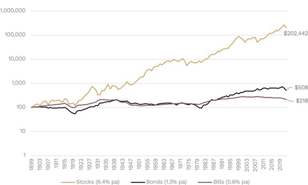
Source: Cambridge Decades of Data, Factset, Ophir. Data from 1 January 1900 to 31 December 2022.
The chart shows how much a US$100 investment in year 1900 (the equivalent of about US$4,000 in today’s dollars) would have grown to by the end of 2022 if you’d invested in U.S. stocks, bonds or bills (you can also think of bills as short-term term deposits for those in Australia).
Here we show it in ‘real’ terms, that is after inflation, because without doing so the numbers start to look nonsensical. And ultimately over long periods of time what investors generally care most about is how much their purchasing power (wealth increases above inflation) has grown.
We’ve also shown it with a ‘log’ vertical axis because again, if we don’t it would look crazy as you would barely be able to see the bonds and bills lines given how much shares won by.
The main takeaway from these charts is usually: 'Wow! It’s insane how much shares have outperformed over the very long term'.
Dramatically less risky
The difficulty many investors have though sticking with shares is they can be volatile/risky/a rollercoaster over the short term.
In this next chart, the gold lines show the real annual returns for the U.S. share market since 1900. They are all over the place. The fact the vertical axis has to go from -60% to +60% to fit the returns in should give you some idea of the wild year-to-year ride.
USA: Real Holding Period Returns – Shares
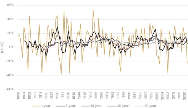
Source: Cambridge Decades of Data, Factset, Ophir. Data from 1 January 1900 to 31 December 2022.
However, we’ve also shown the rolling 5, 10, 20 and 30 year per annum returns in the other lines. The ride becomes a lot less volatile as you move out to longer time horizons.
At 10-year horizons, negative real returns become quite rare. And at 20+ year horizons they disappear completely (historically investors have never lost money in real terms for investing periods of 20 years or more in U.S. shares).
The chances of losing money in the share market has tended to become DRAMATICALLY smaller the longer you are invested.
Positively placid
How does this compare to U.S. bonds, which are once again tempting us with their yields, you may ask?
Using the same sized vertical axis, below you can see that annual U.S. bond returns are nowhere near the same roller coaster ride as shares.
USA: Real Holding Period Returns – Bonds
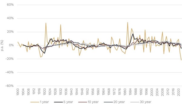
Source: Cambridge Decades of Data, Factset, Ophir. Data from 1 January 1900 to 31 December 2022.
Yes, they can toss you around a little every now and then, but the ride is way less stomach churning and not really going to turn you upside down and have your money fall out of your pockets.
(Note 2022 was one of the exceptions when long-term bond yields increased materially (bond prices declined) and you had high unanticipated inflation producing the largest negative real annual return over this 123-year period!).
Like shares, though, when you move to longer investment horizons, the ride becomes less bumpy and positively placid at 20+ years.
The importance of time horizon
But at longer investment horizons, like 10 or 20+ years, are shares still riskier than bonds? This is a crucial question.
That time horizon is the bare minimum horizon for most investors saving for their retirement.
(Some investors might argue that a 20+ time horizon is way too long. But many, particularly those in accumulation phase, have horizons of 40-50 years, and up to 60 years if you include retirement. Even a retiree at 67 who lives well into their 90s, increasingly common as we live longer, has a horizon of way more than 20 years.)
Yet many investors let year-to-year movements in different asset classes like shares and bonds determine their longer-term allocations.
The risk of doing that is potentially missing out on the power of equities to grow and protect wealth from inflation over the long term.
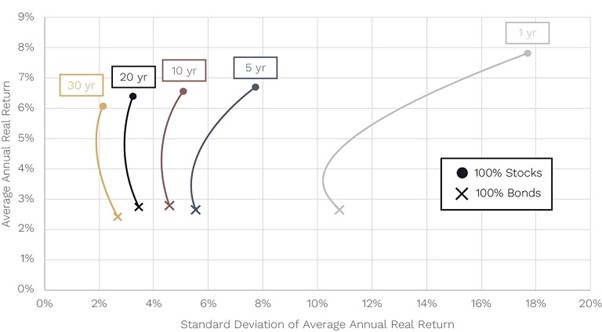
The greatest investment chart
This leads us to what is without doubt our favourite investment chart of all time. Our favourite mostly because it upends that ‘lesson’ from Investing 101: that risk is always related to return … and the riskier an investment, the higher return it should provide you.
It underpins one of the most commonly held assumptions about investing: that stocks are riskier than bonds.
U.S. Equities & Bonds: Risk-Return Trade-Off for Various Holding Periods, 1900-2022
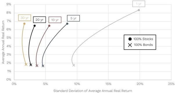
Source: Cambridge Decades of Data, Factset, Ophir. Data from 1 January 1900 to 31 December 2022.
They certainly have tended to provide higher long-term returns. Just see our first chart. And they certainly look riskier over the short term. Just see our second and third chart. But are they riskier over the long term?
Now our favourite chart takes a little explaining. But buckle in because its lesson is worth the effort. It’s a lesson that in our experience many seasoned professionals haven’t even heard or seen of before.
The previous chart shows the average real (after inflation) returns for portfolio mixes of U.S. shares and U.S. bonds on the vertical axis over different holding periods (rolling one year to rolling 30 year) since 1900.
Using standard deviation as a measure of volatility, it also shows the range of outcomes around the average – or how risky – each portfolio is for each holding period on the horizontal axis.
As you can see, as you move down each line (from top to bottom) and progressively add more bonds to your portfolio, average portfolio returns decline.
Nirvana
Historically, a 100% U.S. stock portfolio is way riskier than 100% U.S. bond portfolios over holding periods of one year. A no brainer here – stock returns move around a lot more than bond returns over the short term, as we saw earlier. But here is where it gets interesting.
Historically as your holding period has moved from one year out to 30 years, the riskiness of a 100% U.S. stock portfolio has radically decreased such that by the time you reach a 30-year holding period we enter nirvana.
At 30 years, stocks have earned higher average real returns than bonds (and by a lot we might add!) … but they are also less risky!
Incredible.
This outcome also holds for the Australian share market, as you can see in the chart below. In fact, in Australia, stocks become less risky than bonds at even shorter horizons. By the time you reach a 20-year horizon, stocks are less risky.
Australian Equities & Bonds: Risk-Return Trade-Off for Various Holding Periods, 1911-2022
Source: Cambridge Decades of Data, Factset, Ophir. Data from 1 January 1911 to 31 December 2022.
The prize of patience
Investors only considering the short term may be lured by the siren call of ‘less risky’ bonds. That lure is becoming stronger now that bond yields have become more attractive. But, as we’ve discussed, investors’ time horizons are much longer than many may think.
To reach their investment and retirement lifestyle objectives, long term investors need exposure to the superior long-term returns of shares.
Shares have also tended to be a good long-term inflation hedge due to the ability of companies to pass on price increases. But bonds have a mixed record here and your purchasing power can get crushed during periods of unanticipated inflation that exceeds the fixed levels of income it provides (just see 2022!).
The good news is shares not only deliver superior wealth building and inflation protection, but history suggests they have also been less risky over longer time horizons. It’s a powerful combination for the patient investor.
To the victor go the spoils … if only investors can resist getting worried out of the market by the short-term volatility of shares.
As Warren Buffett once wisely said:
“The sharemarket is a device for transferring money from the impatient to the patient.”
First published on the Firstlinks Newsletter. A free subscription for nabtrade clients is available here.
Andrew Mitchell is Director and Senior Portfolio Manager at Ophir Asset Management, a sponsor of Firstlinks. Analysis as at 18 May 2023. This information has been provided by Firstlinks, a publication of Morningstar Australasia (ABN: 95 090 665 544, AFSL 240892), for WealthHub Securities Ltd ABN 83 089 718 249 AFSL No. 230704 (WealthHub Securities, we), a Market Participant under the ASIC Market Integrity Rules and a wholly owned subsidiary of National Australia Bank Limited ABN 12 004 044 937 AFSL 230686 (NAB). Whilst all reasonable care has been taken by WealthHub Securities in reviewing this material, this content does not represent the view or opinions of WealthHub Securities. Any statements as to past performance do not represent future performance. Any advice contained in the Information has been prepared by WealthHub Securities without taking into account your objectives, financial situation or needs. Before acting on any such advice, we recommend that you consider whether it is appropriate for your circumstances.